Oasis Music Festival
Brand Identity / Experiential / Wayfinding
Oasis is a music festival that brings together DJs from around the world, playing genres like house, dubstep, and trance. Inspired by the spirit of PLUR—Peace, Love, Unity, and Respect—our mission is to create a safe, welcoming space where everyone can be themselves, let go, and dance all night.
Deliverables a music festival featuring a brand booklet, banner poles, kiosks, an immersive event space, and a finalized site plan.
In the early stages of developing the brand, several names were explored including Glo, Radiance, Unity, and Neon City. As the vision evolved, Oasis emerged as the perfect fit.
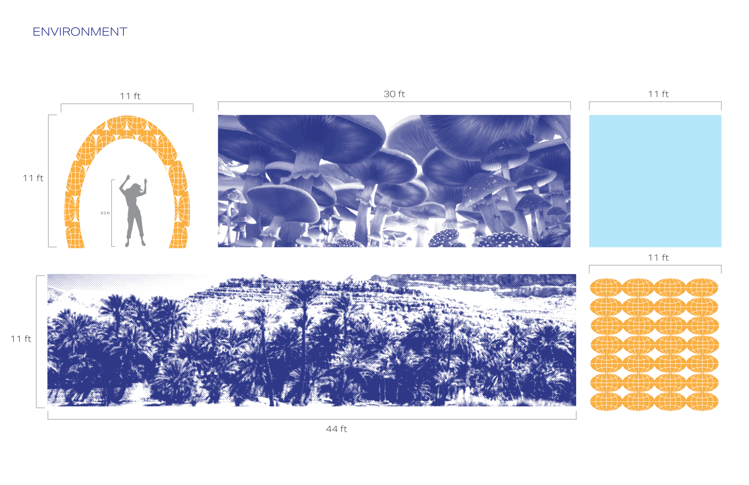
The icons and patterns shown below were designed from the logo to establish a cohesive and visually unified brand identity.
Initial Brand Sketching

Oasis embodies a bold, vibrant spirit through its bright, minimalist color palette. Its use of geometric shapes, particularly globe-inspired forms, creates a strong recognizable visual identity that resonates with the audience.
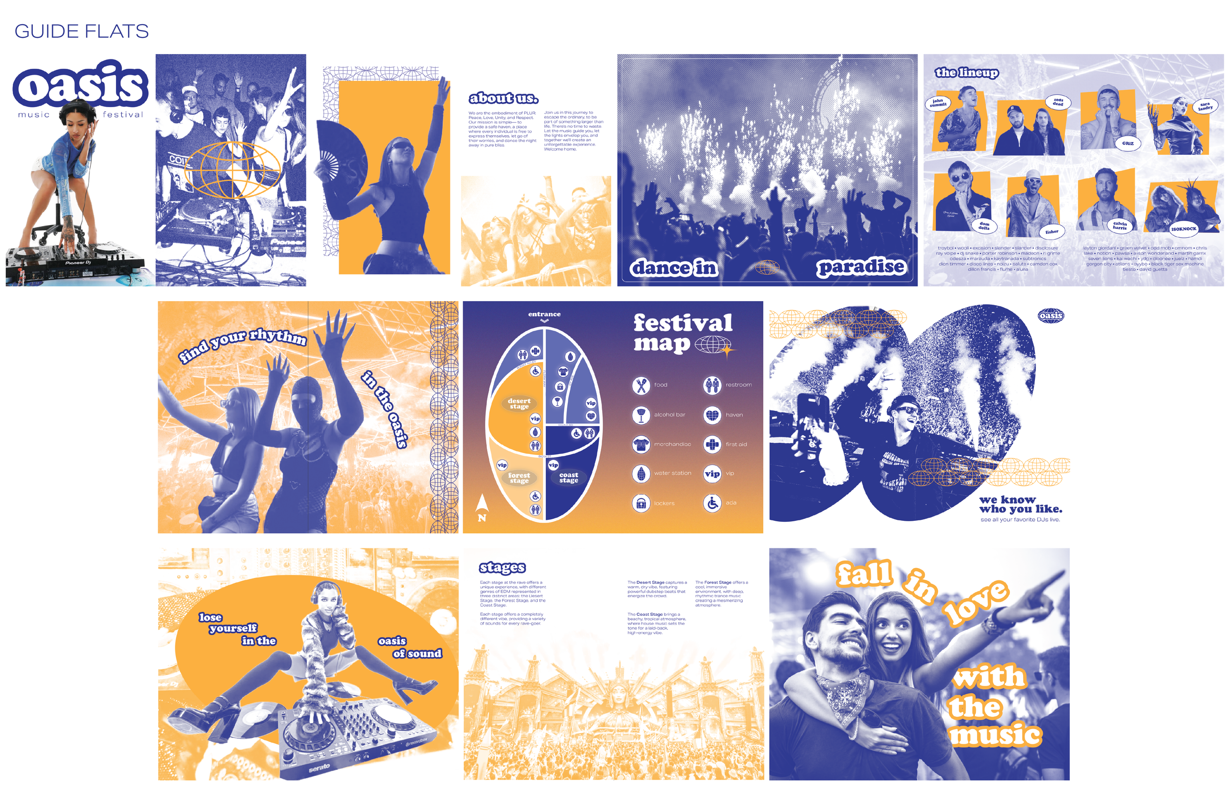
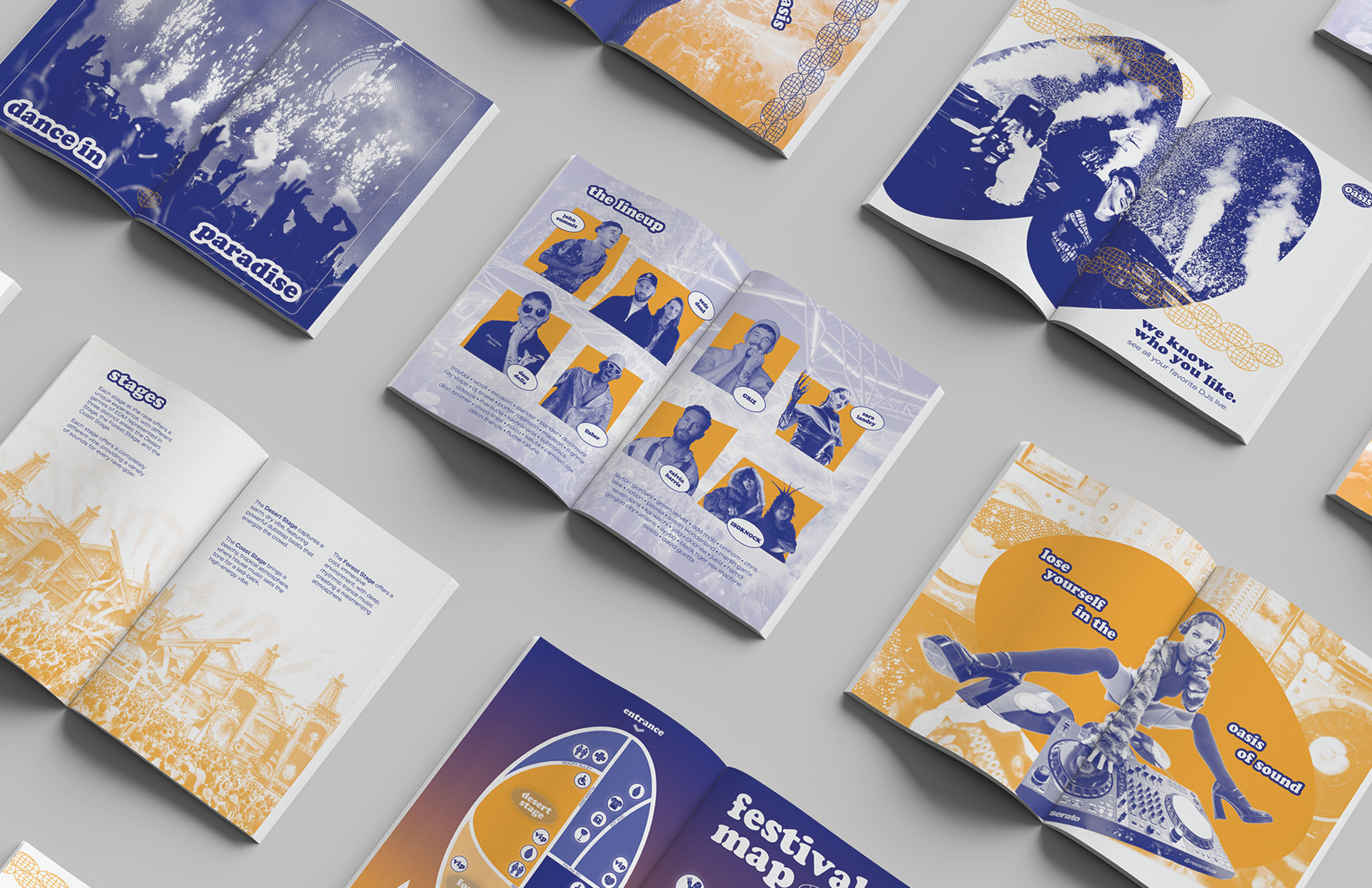
A 18-page booklet was created to highlight and expand upon the brand elements, including imagery, typography, and icons. The consistent use of the Oasis logo and patterns throughout helped bring the brand to life.
Brand Identity


Eight banner poles were designed with careful consideration of their placement and visibility from elevated viewpoints. Each banner reflects the brand identity, incorporating imagery from the brand booklet to ensure visual consistency.
Banner Poles


Two kiosks were created with the purpose of enhancing placemaking and wayfinding.
To maintain a cohesive brand identity, I used the brand’s dark blue and white color palette and incorporated branded icons into the way finding signage.
Kiosks

Event Enviornment
By thoughtfully combining all brand elements, the event experience truly comes to life. Designed as an escape within a large music festival, the two-story structure embodies the brand through its immersive visual and spatial storytelling.
To complement the orange tones in the color palette, I incorporated gold metal finishes—adding warmth and a sense of luxury that reinforces the brand identity. Cohesion was achieved by integrating imagery that follows the same color treatments outlined in the brand guide. Globe icons are prominently featured throughout the space—on tables, walls, and the stair railing—further emphasizing the brand's presence. The result is a relaxing, visually unified "oasis" that offers festival-goers a place to recharge and reconnect with the brand.